Everything you need to represent kind365 consistently - logo, color, type,
voice, program brands, and assets. Built for partners, press, employees, and creators.
Brand story
kind365 exists to make kindness a daily habit - one small act at a time.
Our brand should feel warm, optimistic, and quietly confident: a gentle
nudge, not a lecture.
Mission
Help people complete a random act of kindness every day, track progress,
and turn generosity into a lasting habit - alone or with their community.
Promise
One kind act a day. Simple tools, real streaks, real impact - for people,
workplaces, classrooms, and congregations.
Personality
Friendly · Hopeful · Clear · Inclusive · Playful without being childish
(except in Kids Mode, where playful is the point).
“Spread kindness every day.” - our tagline. Short, active, and universal.
Logo & wordmark
The primary mark is the lowercase wordmark kind365 set in
Filson Soft Bold. There is no separate symbol required next to the wordmark
in marketing; the app icon stands alone as the product mark.
kind365
Primary - light Teal wordmark on white or light gray. Default for marketing sites and documents.
kind365
Primary - dark Light teal / mint wordmark on near-black. Use in dark UI chrome and night-mode marketing.
kind365
Reversed White wordmark on brand teal. Banners, store screenshots, social cover crops.
Program lockups
Program sites append a suffix in system sans (not Filson). Keep the wordmark
teal; suffix is muted uppercase tracking.
kind365
for Business
kind365
for Education
kind365
for Churches
Clear space & minimum size
kind365
Keep clear space around the wordmark at least the height of the “k” on all sides. Don’t crowd it with other logos or dense copy.
Don’t stretch, skew, or outline the wordmark.
Don’t recolor it outside the approved palette (teal, white, light teal on dark).
Don’t set the product name in all caps: KIND365.
Don’t insert spaces or hyphens: kind 365, kind-365.
Don’t place the wordmark on busy photography without a solid or scrim.
Minimum digital width: ~96px for the full wordmark; prefer larger in headers.
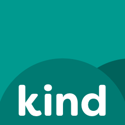
App icon
The app icon is the product’s primary graphic mark - used for installs,
favicons, PWA, and social avatars. Prefer the PNG master; keep corner radius
platform-native (iOS/Android mask the square).
Do: use the full-bleed icon on solid brand or neutral backgrounds.
Don’t: add drop shadows, text, or badges on top of the master artwork for marketing.
Color system
Teal is the brand anchor. Neutrals carry most UI. The consumer app also
offers a full accent palette users can personalize - those colors are
first-class brand accents for illustrations and campaigns.
kind365 reminds you to complete one random act of kindness a day. Build a streak, celebrate milestones, and invite your workplace, class, or church to join you.
Body ~16px / 1.6 line-height. Muted color for secondary lines. Prefer short paragraphs.
Role
Size (web)
Weight
Notes
Hero
clamp 2-2.9rem
800
Tight tracking
Section
~1.5rem
800
Page structure
Body
1-1.05rem
400-600
Readable on mobile
Label / chip
.72-.78rem
700
Uppercase + tracking OK for labels only
Wordmark
context
Filson 400
Never all-caps
Voice & tone
Tone analysis for writers, support, social, and product copy. We sound like
a kind friend who happens to build software - never a corporate CSR brochure.
We are
Warm: encourage, don’t guilt.
Clear: plain language first.
Optimistic: small acts compound.
Inclusive: anyone can start today.
Human: contractions, short sentences.
We are not
Preachy: no moral superiority.
Corporate-cold: avoid jargon stacks.
Cynical: humor is gentle, not snark.
Salesy: features serve the habit.
Exclusive: no “only for the elite givers.”
Tone spectrum
Context
Energy
Formality
Example
Product (empty states, CTAs)
Upbeat, brief
Casual
“Ready for today’s act?”
Milestones / celebrations
High, joyful
Casual
“7 days strong - you’re building a real habit.”
Support / legal
Calm, steady
Clear-neutral
“Here’s how to delete your account and what we remove.”
Business / ESG
Confident
Professional-warm
“Document the value of volunteered time - without another spreadsheet.”
Education
Encouraging
Teacher-friendly
“One class code. Daily kindness. No grading required.”
Churches
Respectful, hopeful
Warm-formal
“Carry kindness from Sunday into the other six days.”
Kids Mode
Playful, big
Very casual
“YES! You did it!”
Do say
“One small act today.”
“Your streak is waiting - no pressure, just a nudge.”
“Invite your team with a single code.”
“We donate ad proceeds beyond basic costs to charity.”
Don’t say
“You’re a bad person if you skip.”
“Disrupt the kindness paradigm with synergy.”
“Only elites build real habits.”
“Guaranteed to change the world overnight.”
Writing system
Mechanics that keep product, marketing, and support aligned.
Topic
Rule
Examples
Product name
Always lowercase kind365 in body copy. Never “Kind 365” or “KIND365”.
kind365 · kind365 for Business
Program names
“kind365 for Business / Education / Churches / Kids”
Not “Kind365 Business Edition”
Acts
“act of kindness” / “acts” - plain and concrete
“Log today’s act”
Streaks
Celebrate without shaming misses; repairs exist
“Repair a day” not “you failed”
Buttons
Verb-first, 1-3 words
Get the App · Start free · Download PDF
Dates
Local calendar days for user acts; UTC only for global admin periods
User-facing: “today”, “yesterday”
Emoji
Sparingly in marketing; Kids Mode may use more
Prefer one meaningful emoji, not a parade
Program brands
Same parent brand, distinct promises. Reuse the wordmark; vary accent and audience language.
Consumer
kind365
Daily acts, streaks, friends, charity voting. Default teal. Home of the product story.
Business
for Business
Culture, wellbeing, documented impact value of volunteered minutes. Teal + professional-warm tone.
Congregation habits and service beyond Sunday - amber accent. Respectful, hopeful language.
Kids Mode
A separate visual system for child accounts: candy palette, rounded type,
giant targets, and Kindly the heart mascot. Grown-up chrome is recolored coral
in Kids Mode - never mix adult dense UI into kid surfaces.
Bright · Rounded · Instant joy
Sky gradients, chunky buttons, sticker-like rewards. Colors stay vivid in light and dark; surfaces adapt.
Coral#FF6B8AKids chrome accent
Grass#43C97FYES / success
Berry#2B3A67Kids ink
Imagery & product art
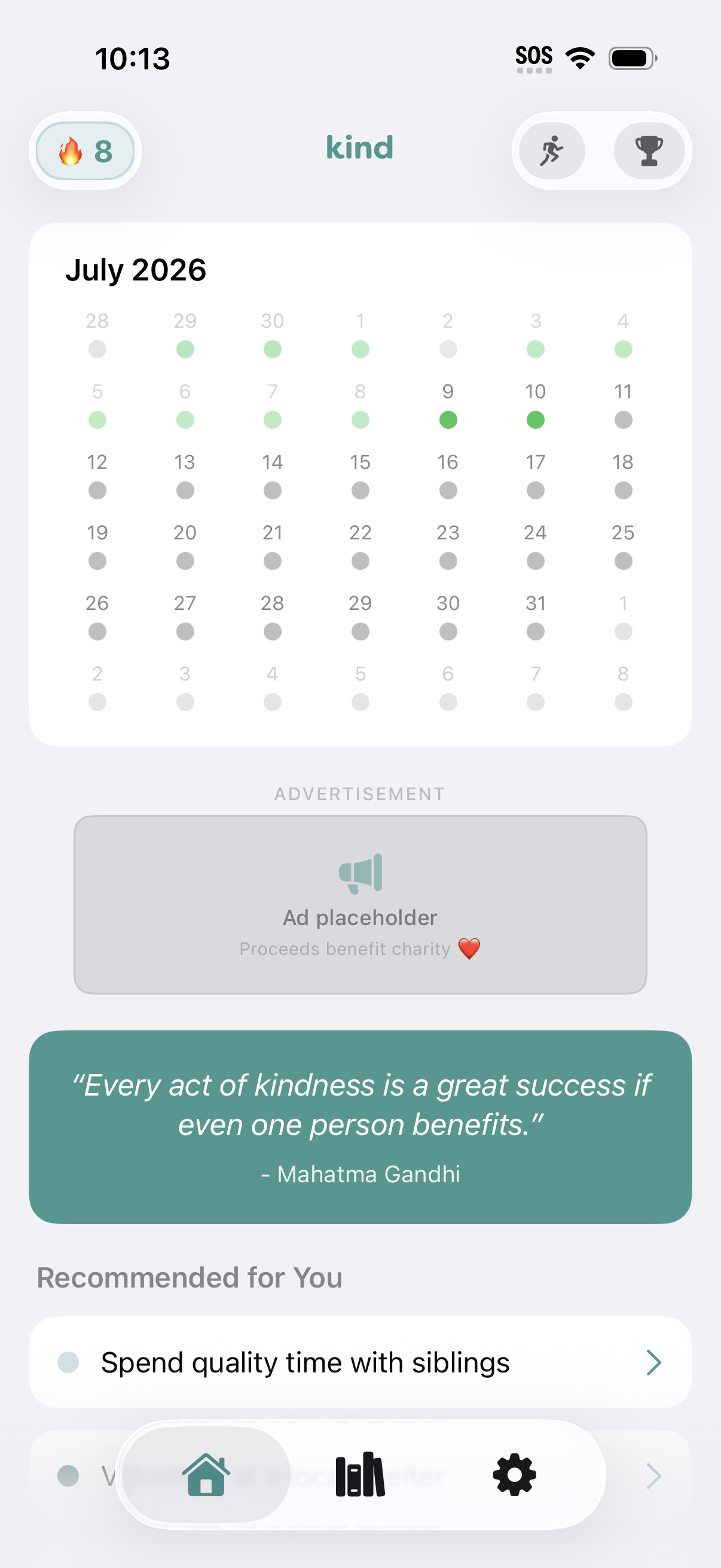
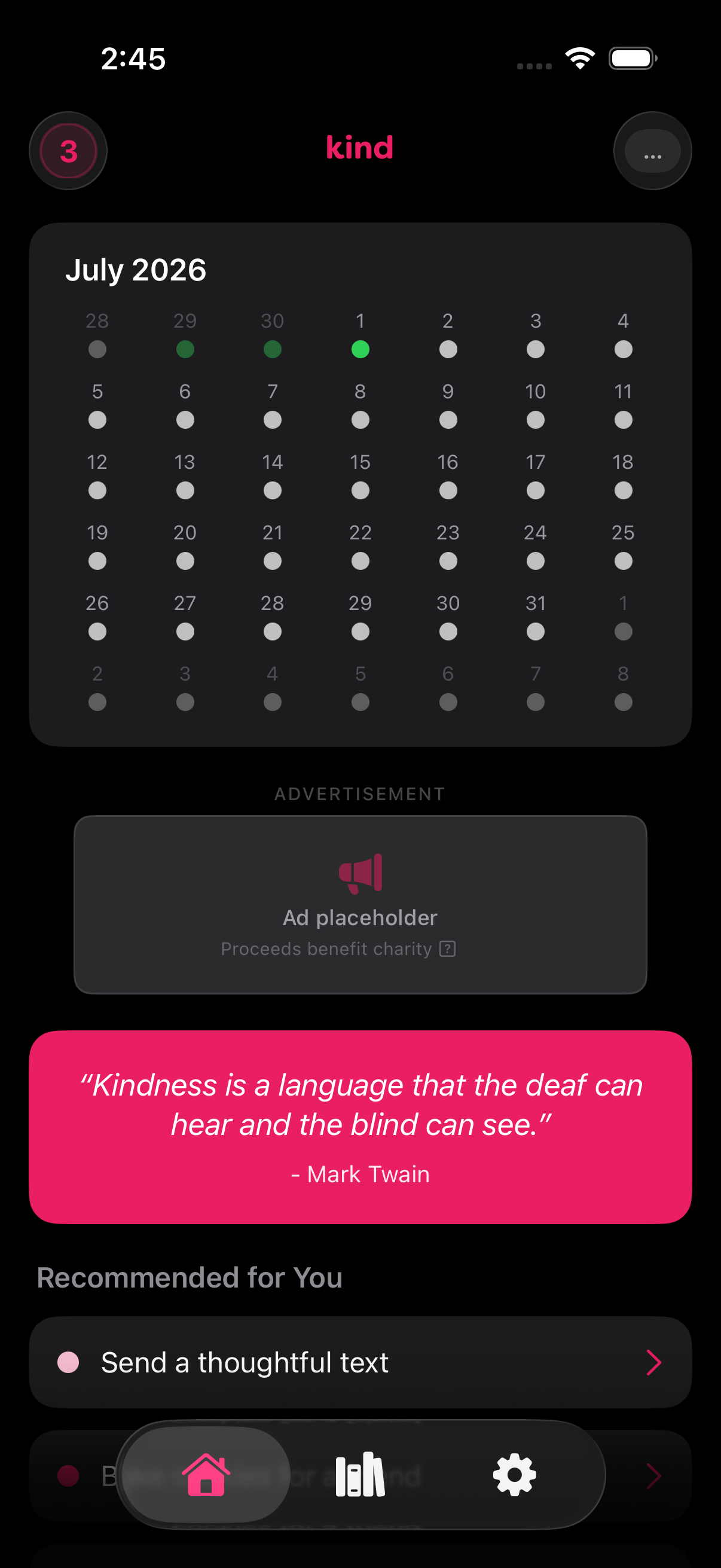
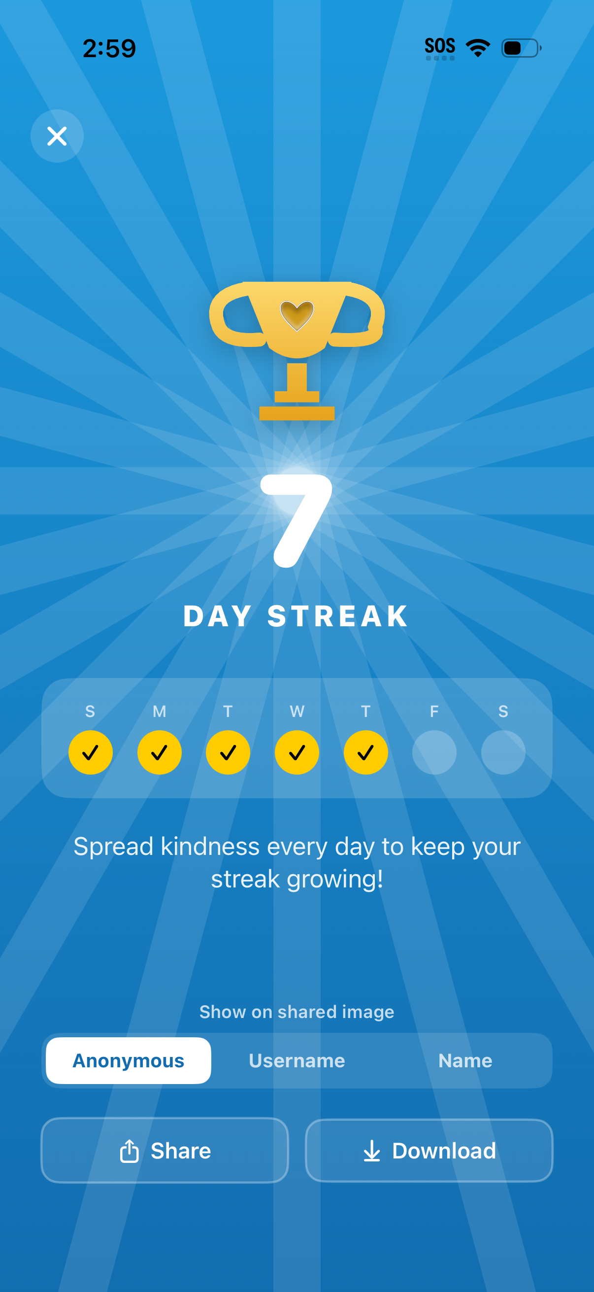
Prefer real product UI over stock “handshake” clichés. Screenshots should feel current and honest.
Home - light
Home - dark
Streak celebration
Do use device frames sparingly; soft shadow, realistic bezels.
Do show diverse, everyday kindness - not performative charity photo ops.
Don’t fake App Store ratings, UI that doesn’t exist, or misleading stats.
Don’t overlay heavy filters that shift brand teal off-spec.
Social & share images
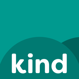
Ready-made cover art for every site wing - used automatically as the link-preview
image on Facebook, LinkedIn, Slack, Discord, WhatsApp, and iMessage/SMS rich links
(via Open Graph & Twitter Card tags), and available here as downloads for manually
uploading as a Twitter/X header, Facebook Page cover, or LinkedIn banner.
Each card is the app icon lockup with the Filson Soft Bold wordmark on brand teal, a
program badge where relevant, and a one-line description matching that wing's mission -
so a shared kind365 link always identifies itself correctly, even to a reader who never
clicks through.
UI patterns (product & web)
Shared tokens so marketing, portals, and the app feel like one family.
Radius
Cards 16px, form controls 10px, marketing CTAs full pills (100px). Kids Mode: chunkier, offset “hard lip” shadows.
Wordmark: set the text “kind365” in Filson Soft Bold at brand teal -
there is no separate SVG logo file required. For partnership decks or
co-branded work, email contact@kind365.app.
Employees: this page is the source of truth for brand.
The Employee Hub “Brand kit & voice” article links here -
use these specs before any external deck, flyer, or social post ships.
Social & share images
Ready-made cover art for every site wing - used automatically as the link-preview image on Facebook, LinkedIn, Slack, Discord, WhatsApp, and iMessage/SMS rich links (via Open Graph & Twitter Card tags), and available here as downloads for manually uploading as a Twitter/X header, Facebook Page cover, or LinkedIn banner.
Each card is the app icon lockup with the Filson Soft Bold wordmark on brand teal, a program badge where relevant, and a one-line description matching that wing's mission - so a shared kind365 link always identifies itself correctly, even to a reader who never clicks through.